
- Bookmarks
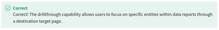
- Drillthrough filters
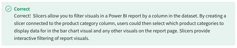
- Slicers
- Custom visuals
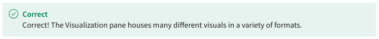
- To house a collection of visuals that display data insights in a variety of formats.
- To visually review the data in your tables and manage your data model.
- To allow you to explore a newly created report and adjust data by selecting slicers.
- To filter data when creating date grouping matrix visualization
- Slicer Settings
- Stacked Column Chart
- Grouping analysis

- Combo Chart
- Manually typing
- Copy and paste
- By Uploading
- By Dragging

- Select the Publish button and then view in browser

- You cannot view the report until admin approves it
- Select View Report and open new window
- Simply select the report in the canvas
- Users can see underlying data that makes up the previously selected data
- It allows other users to view the report
- It enables users to expedite the process
- Users will be able to publish directly from the browser
- To resize cards to look like banners
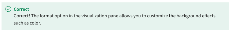
- To customize background effects.
- To drag the products table category field
- To resize tables of underlying data
- To provide visualization of the data
- To make the data more engaging
- To display the historical progression of the data
- To add movement to the data
- Hover over the bubble on timeline
- Click point on timeline
- Conduct a search in the search bar
- Select the scatter chart
- To display the historical progression of data
- To see underlying data of specific selected data
- To use your historical data to forecast future data
- To provide analysis based on date groupings