- Histogram
- Pie chart
- Bar chart
- Scatterplot
- ggplot()
- qplot()
- ggplot(salesdata, aes(x = feature1, y = feature2))
- ggplot(salesdata)
- True
- False

- Leaflet
- None, you will use base R
- qplot
- ggplot2
- Horizontal bar chart
- Stacked bar chart
- Grouped bar chart
- Bar chart
- ggplot2()
- geom()
- qplot()
- ggplot()

- True
- False
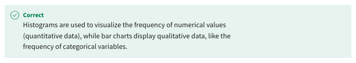
- A histogram displays quantitative data, while a bar chart displays qualitative data.
- A histogram displays qualitative data, while a bar chart displays quantitative data.
- A histogram counts the frequency of each individual number in the data set.
- A histogram divides data into bins and then counts the number of times a data point falls into each bin.

- Grouped bar chart
- Stacked bar chart
- Horizontal bar chart
- Bar chart
- colour = I(“blue”)
- fill = I(“blue”)
- border = I(“blue”)
- outline = I(“blue”)
- Always go with the default number of bins.
- Reduce the number of bins to increase the bin width.
- Increase the number of bins to reduce the bin width.
- Changing the number of bins has no impact of the smoothness of the histogram.
- Add the geom_bar(position = “stack”) command to the ggplot() function.
- Add the geom_bar(position = “dodge”) command to the ggplot() function.
- Set the x argument of the aes() function used in the ggplot() function to the factor.
- Add the geom_circle() command to the ggplot() function.