
- E-Bikes
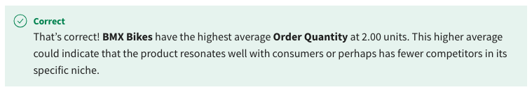
- BMX Bikes
- Kids Bikes

- Hybrid Bikes
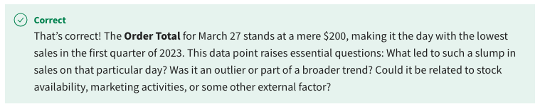
- March 27
- March 26
- January 29
- February 10
- E-Bikes
- Mountain Bikes
- BMX Bikes
- Road Bikes
- Cross Country
- Downhill

- Racing Long
- Distance
- To customize the report background.
- To adapt the report for different viewing platforms.
- To adjust the layout of the report page.
- To set the page name and provide context.

- Text boxes
- Tables and bar charts
- Tables only
- Pie charts only
- They assist in real-time decision making.
- They simplify complex data.

- They make data more accessible to a broader audience.

- They reveal patterns, trends, and correlations hidden in raw data.

- The color preferences of the stakeholders.
- The type of data and insights they want to communicate.
- The availability of visual effects.
- The data source being used for the visualization.
- To show part-to-whole relationships over time or across categories
- To compare large quantities or categories
- To display exact numbers in a comprehensive manner
- To compare fewer than ten categories in a vertical orientation
- Metrics only
- Insights and narrative only
- Visualizations, metrics, and insights
- Visualizations and metrics only
- Report Canvas

- Ribbon
- Filters pane
- Fields pane
- The ribbon allows you to save your project.
- The ribbon helps in applying filters to your report data.
- The ribbon allows you to change your report view.

- The ribbon can be used for manipulating fields in your report.
- A field for the Legend to break down the data into different categories.

- A field for drill-through to enable further data exploration.
- A field for the X-axis to represent time intervals.

- A field for the Values to aggregate data.
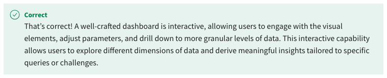
- Dashboards are interactive and allow users to drill down into specific details when needed.

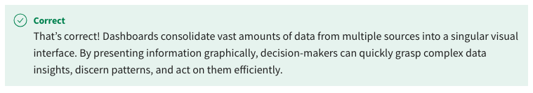
- Dashboards play a pivotal role in transforming raw data into actionable insights, providing a comprehensive view of business performance.

- Dashboards can only represent data in the form of charts.
- Dashboards present critical business data in visually understandable way, aiding decision-making.

- To offer a more granular view with other metrics
- To refine the way data is visualized in a report
- To help in comparing and analyzing patterns over a specified time period
- To visually represent two different yet interconnected data points

- Perceivable

- Text-based only
- Understandable

- Exclusive to screen reader users
- Line chart
- Area chart
- Heat map
- Scatter chart
- They enhance the accessibility and readability of reports.

- They include built-in AI capabilities.
- They automatically enforce data quality rules.
- They offer predefined sets of colors, fonts, and styles.
- To offer snapshot insights into data trends
- To replace the need for screen readers for visually impaired users
- To act as a substitute for textual descriptions in reports
- To provide additional contextual information about data points in visuals
- It eliminates the need for filtering data in the main report.
- It reduces the complexity of the main report.

- It prevents unauthorized access to detailed data.
- It reduces the loading time of the main report.
- To improve report responsiveness
- To make it easier to export data
- To focus on a specific subset of data by removing irrelevant data points
- To rearrange the data in ascending or descending order
- Cross-highlighting is more visually intensive than cross-filtering.
- Cross-highlighting allows multiple selections while cross-filtering doesn’t.
- Cross-filtering hides unrelated data, while cross-highlighting dims them.
- Cross-filtering is the default behavior for most visuals in Power BI.
- Supports both descriptive and inferential statistics
- Offers the option to extend capabilities through plugins
- Allows for a range of built-in statistical functions
- Utilizes DAX language for custom calculations

- Both grouping and binning are distinct features available in all versions of Power BI.
- Grouping is typically used for text data, and binning is exclusively for numerical data.
- Binning in Power BI will automatically categorize data into specific intervals or bins.

- Grouping in Power BI provides a manual method to divide data points based on user-defined criteria.

- A histogram represents the distribution of values between two variables.
- Histograms focus on a single attribute across its X and Y axes, showing the distribution of numerical data points.
- Histograms can be used to understand the frequency distribution of top or bottom values in a dataset.
- Histograms primarily visualize the distribution of numerical data across specific ranges or bins.
- To provide deeper insights into correlation metrics
- To enhance the interpretability of data distributions
- To optimize the visual representation of data sets
- To analyze data dispersal and pinpoint outliers

- Categorical axes in Power BI organize data into distinct categories without inherent numerical order.
- Power BI solely relies on manual input to determine the axis type.
- All axes in Power BI are automatically set to continuous by default.
- Continuous axes in Power BI can represent numerical data points with an inherent order.

- Automatically detecting patterns and trends in the data
- Explaining specific increases or decreases in datasets
- Suggesting future trends based on historical data
- Providing a unified view of data from different sources
- It provides a platform for team collaboration and discussions.
- It replaces the need for traditional business meetings.
- It offers interactivity, enabling users to engage and drill down into specific data details.
- It visualizes critical information in a consolidated manner, making data easier to understand.
- It provides a catalog of sample questions to guide user queries.
- It enables users to ask questions in plain English and get answers in the form of visuals or numbers.

- It adapts and refines its answers based on historical user interactions.
- It modifies the underlying dataset based on the questions asked.
- Within the Model view, select Convert to PDF option
- Within the Data view, using the Export feature
- Within the Report view, select the New PDF Report function
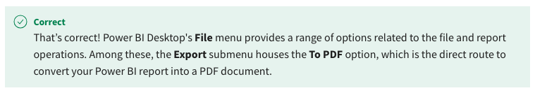
- Within the File menu, proceed to Export and select To PDF
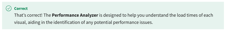
- It provides insights into the load time for each visual element in a report.
- It offers suggestions for visual optimizations based on current performance metrics.
- With insights from the Performance Analyzer, you can take targeted actions to improve the performance of lagging visuals.

- It automatically optimizes the report’s design based on user feedback.
- Set the Page Information to Widescreen Presentation.
- Use a gradient for the Canvas Background.
- Adjust the Canvas Settings to a 16:9 layout.

- Adjust the Canvas Settings to a 4:3 layout.
- To serve as the workspace for arranging and organizing multiple visuals

- To offer filtering options for specific data
- To choose the types of visualizations for your report
- To list the data fields available for use in your report
- To provide high-level command options for manipulating the report
- To assist in dragging and dropping fields into the report
- To select the types of visuals like bar graphs, pie charts
- To filter data for targeted reporting
- False

- True
- Combo charts show the contribution of individual parts to a whole.
- Combo charts provide trend lines for a subset of data.
- Combo charts visually represent two different yet interconnected data points.
- Combo charts summarize real-time data.
- To simplify visual content
- To offer descriptive information for screen readers
- To provide subtitles for audio narration
- To enhance user interaction
- By selecting it as an additional option within the Power BI Service online.
- By syncing the theme from an existing report.
- By downloading a JSON file and importing it through the Themes dropdown menu.

- By dragging and dropping it into the report.
- They allow users to access updated data metrics.
- They allow hiding visuals that are not important.
- They remove the need for textual descriptions in a report.
- They condense information into pop-up boxes that appear upon hovering over a data point.

- Structuring data from a general overview to detailed levels

- Enhancing data visualization options
- Facilitating custom data filters
- Enabling data drill-down capabilities within a single visual
- To navigate to a context-specific tooltip for more information
- To enhance user engagement by adding interactive elements to a single page
- To navigate from one report or visualization to another or to a detailed page focused on a specific aspect of the selected data point
- To provide more detailed views of data within the same visualization
- Cross-highlighting dims or fades unrelated data but still displays them.

- Cross-filtering allows a selection in one visual to filter out unrelated data in another visual.

- Cross-highlighting is used to display raw data directly.
- Cross-filtering is the default behavior for most visuals in Power BI.
- An in-built feature for automated report generation
- A comprehensive range of statistical functions used for data analysis.
- A visual representation of all data entries in a dataset.
- A DAX-enabled set of functions for data computation and analysis
- Data Sorting
- Data Binning

- Data Theme Selection
- Data Drill-Down
- To identify outliers in your data
- To visualize data points based on their attributes
- To discover groups of similar data points within your dataset
- To enhance data-driven decision-making
- Assisting in future business projections
- Streamlining data for better visualization
- To automatically detect patterns, trends, and anomalies in the data

- Simplifying data source integrations
- They allow users to create annotations within visualizations.
- They can provide a comparative measure for data points in a visualization.
- They primarily act as dividers between distinct data categories.
- Reference lines can be added to a visualization to emphasize key insights or pieces of information within the data.

- It uses natural language processing to answer questions about the data.

- It prompts users with a series of pre-determined questions.
- It uses predictive analytics to offer insights based on the questions.
- It acts as a query interface, routing questions to a database for answer retrieval.
- To prepare the report for PDF export
- To structure complex data sets more clearly across distinct sections
- To segment visual elements for focused analysis
- To make the report easier to navigate and understand

- To enhance the readability and user engagement of visualizations.

- To simplify data interpretation for end-users.
- To provide immediate insights into data trends.
- To highlight important data points for analysis.
- They replace the need for textual reports.
- They help in making data more memorable and persuasive.
- They eliminate the need for stakeholder meetings.
- They serve as an archive for historic data.
- Bar or column chart
- Scatter plot
- Line chart

- Pie chart
- To visualize the cumulative effect of various financial elements
- To compare the monthly sales of different departments
- To display the shift in product popularity rankings over quarters
- To visualize the sequence of business processes
- Web content should prioritize aesthetics over functionality.
- Web content is accessible to people with disabilities.

- Web content should be exclusive to people who use screen readers.
- Web content should only be text-based to ensure simplicity.
- Filter pane settings

- Font family, size, and color

- Data label positioning
- Visual interactivity options
- Cross-highlighting

- It varies depending on the data source.
- Cross-filtering
- It varies depending on user settings
- The correlation between variables
- The overall distribution pattern of top values in a dataset.
- The distribution of numerical data across specific ranges or bins

- The frequency of occurrence between two data points.
- To categorize and classify diverse datasets
- To discover groups of similar data points within a dataset
- To separate data based on predefined labels
- To identify outliers within a dataset
- It is designed for data points with no inherent order.
- It represents data points that can be integers or decimal values.
- It’s a primary choice for representing timelines in Power BI.
- It organizes data into distinct categories, such as names or groups.
- It enables detailed and focused analysis by segmenting visual elements.

- It simplifies data by categorizing it into separate pages.
- It enhances report navigability and comprehension.

- It aids in the preparation for PDF document exports.
- To analyze the accuracy of data in your report
- To measure the loading time of each visual element in your report

- To optimize data storage used by your report
- To audit the quality of data in your report