

- Publish report to Power BI service, create a dashboard and pin report visuals to the dashboard and generate QR code.
- Publish report to Power BI service and generate a QR code of the report.

- Publish report to Power BI service, pin entire report to dashboard and generate QR code.
- 0.14M
- 0.41M
- 0.19M

- The 1st quarter sales of 2020 is lower than the same period last year.
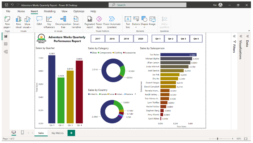
- Despite an increase in the sales, the profit margin is negligible.
- Australia has no sales for the first quarter of 2020.
- By using SQL queries.
- By using Power Query editor.
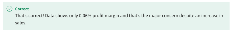
- By using DAX logic.
- True
- False

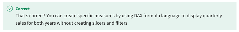
- Map visual
- Bar chart
- Waterfall chart
- Line chart
- Triadic

- Harmonious
- Complementary

- Analogous

- Area chart
- Bubble chart
- Scatter chart
- Font size.

- Grids and guides.
- Strategic positioning.
- Headings and subheadings.

- True
- False
- M
- I
- R
- Install Python.
- Install the visualization libraries of Python.

- Make sure the Microsoft Power BI Python home directory path is correct.

- Transform data using Python in the query editor.
- Filled map
- Azure maps
- Shape map
- Shape maps
- Filled maps

- Map

- Azure maps

- Categories
- Month

- Countries
- Year
- True

- False
- Visualize the sales amount over time and create a product slicer for interactive analysis.

- You can write DAX logic to group products for visualization.
- Use scatter charts as they are designed to visualize high-density data.
- A treemap

- A pie chart
- A dot plot chart
- True
- False
- R

- SQL
- JavaScript
- A bubble chart

- Scatter chart
- A dot plot chart
- Chart background color
- Table columns fonts
- Chart title
- Column colors
- Use clean and professional design.
- Introduce interactive elements.

- Use vibrant colors.

- Use engaging icons.

- Using transport layer security (TSL) protocols.
- Using HTTPS (Hypertext Transfer Protocol Secure) protocol.
- Using data validation.

- Using error detection.

- Accent colors

- Semantic colors
- Dominant colors
- True

- False
- True
- False

- Image resolution should be 300 dpi
- Image should be published online
- The image should not have security credentials set on

- Image should not be an .SVG format
- It should contain the key metrics of the business.
- It must be understandable and actionable.
- It should be visually appealing.
- Add an image file and use the title and subtitle as hyperlinks.

- Pin the visual from the Microsoft Power BI report containing the URL.
- Add the site as a hyperlink in the text box tile.

- Select web content and embed the code.

- 5
- 1
- 3

- Narrative
- Visualization
- Data

- A bar chart

- A column chart
- A pie chart
- Use shades of same color family.
- Use divergent colors to make the map visually appealing.
- Use analogous colors from the color wheel.
- An individual visual element from your report.
- An entire dashboard.
- An individual tile of your dashboard.

- An entire report.

- True
- False

- 3
- 4

- 5
- Dot plot chart
- Scatter plot

- Line chart
- Bubble chart

- Use of media elements.
- Use of grids and guides.

- Consistent typography.

- Consistent color schemes.

- Delete the chart and install a custom visual from AppSource that allows you to format the chart.
- Delete the chart and use a Microsoft Power BI core visualization that you can format according to the requirements.
- Modify the Python code to change the color, font, and style of the chart.

- Filled maps
- 3D maps
- Shape maps
- A Funnel chart
- A KPI chart

- A Waterfall chart
- A Gauge

- True
- False

- Drillthrough

- Drill down
- Slicers
- Google maps
- Bing maps

- Waze maps
- Python visuals do not support renaming columns and fields in Microsoft Power BI.
- Using Python in Microsoft Power BI raises security concerns.
- Python has limited visualization capabilities.
- The input data size is limited to 250MB.
- True

- False
- Cultural considerations

- Job function
- Information needs

- Data source requirements
- JSON

- DOCX
- XLSX
- Push dataset
- Streaming dataset

- SQL Server
- PubNub streaming dataset
- Build a new theme from Microsoft Power BI desktop.
- Build a new theme for the query editor.
- Create your own color scheme and upload it to Microsoft Power BI as a JSON file.

- Customize any built-in theme of Microsoft Power BI to match your design needs.

- Data transformation.

- Configuring relationships.
- Data connectivity.

- Creating measures.
- Target value

- Percentage difference

- Sales breakdown by trend axis.
- Time

- A dot plot chat
- A 3D scatter plot

- A scatter plot
- By using a different color.
- By making the text bold.
- By creating a card visual.
- Click-through rates.
- Competitor analysis.
- Website traffic information.
- Customer satisfaction scores.
- A Playlist hosted on YouTube.

- A single video hosted on YouTube.
- A single video saved to your local computer.
- A single video published on your social media.
- Streaming dataset
- Push dataset

- PubNub streaming dataset
- They provide structure to your data story
- They provide context to your data story

- They provide automation for chart selection