- True
- False

- Bikes
- Accessories
- Components

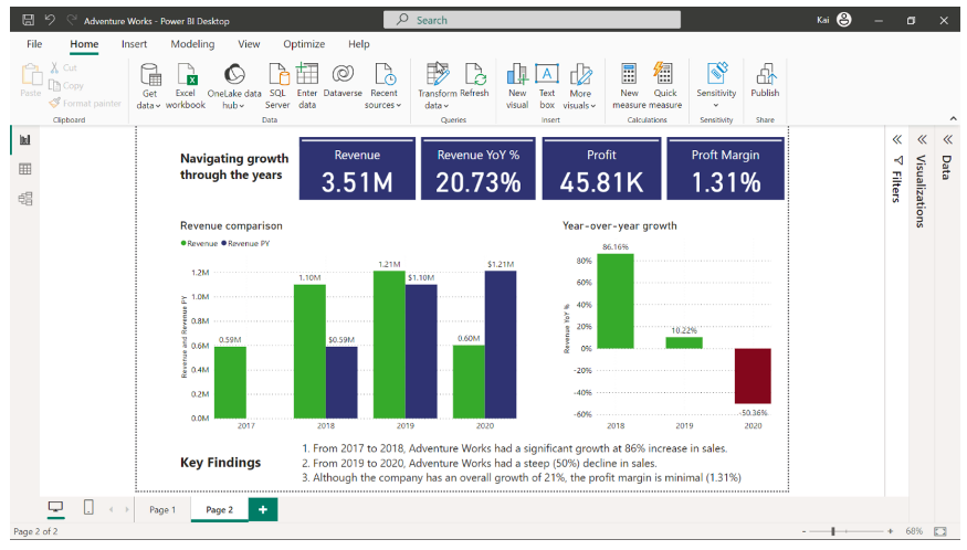
- 6,560

- 10,234
- 370
- Single page layout
- High level KPIs
- Interactive filtering

- Drill through functionality

- Displaying detailed data exploration.
- Providing high level insights about the data.

- Providing a summary of the data with drill through to the details analysis.
- True

- False
- Underlying dataset

- Only report page
- The data model and relationships

- All measures you created.

- True

- False
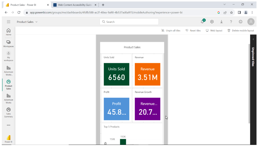
- Sales dashboard
- Marketing dashboard

- Customers dashboard
- Create a QR code of the tile containing the inventory level of products and use the code as an email attachment, orattachment or display it in a common area of your office.

- Create a separate report for the inventory- levels of products and share it with team members.
- Optimize the dashboard for mobile so each team member can access the information while inspecting the warehouse.
- PNG

- JPG

- BMP

- SVG
- True

- False
- Web content

- Image

- Spreadsheet
- Video

- Streaming dataset
- Push dataset

- PubNub streaming data
- Publish report to Power BI service, pin entire report to dashboard and generate QR code.
- Publish report to Power BI service and generate a QR code of the report.

- Publish report to Power BI service, create a dashboard and pin report visuals to the dashboard and generate QR code.
- Pie chart
- Bar chart

- Line chart
- By managing appropriate relationships between tables
- By choosing the correct chart type for visualization

- By designing a logical canvas layout

- By crafting a clear narrative

- True

- False
- It increases understanding of the narrative by providing context throughout your data story.

- It helps in data source optimization.
- It assists in the selection of an appropriate chart type for the data type.
- A technical error in the data.
- A distraction from the main narrative of the story.
- A central issue or challenge that the data analyst aims to resolve.

- True

- False
- To display the data in visually appealing and colorful charts.
- To provide context and interpret results.

- To improve audience engagement.

- To explore and communicate data patterns effectively to the stakeholders.

- Add an individual color to each Australian state to create a divergent and colorful map.
- Add a single color with different saturation levels based on the sales amount.

- Add product category to the legend well and allow Microsoft Power BI to auto-color each state.
- Reports are detailed and structured documents.

- Reports typically contain a single canvas.
- Reports typically contain high-level metrics and KPIs.
- Reports support filtering and drill-through.

- The tile is opened in focus mode
- An edit window appears on the screen where you can edit the tile.
- The source report of the tile is opened on the screen.

- Microsoft Power BI service

- Microsoft Power BI mobile app
- Microsoft Power BI desktop
- True
- False

- Data context

- Data cleaning
- Data transformation
- Data transformation to clean the data and remove any errors before visualization.
- Data exploration to identify which fields are needed to support the story.

- Chart selection to determine which chart is appropriate for the given data type.
- True

- False
- Focus solely on historical analysis to provide context.
- Prioritize the most valuable information and avoid presenting too much data.

- Include all available data to provide comprehensive information in the dashboard.
- True

- False
- True

- False
- You can add one representative image as a URL and share the entire gallery as an external URL of the image tile.

- You can select one representative image and embed all images of the gallery in an image tile in a dashboard.
- You can create a dashboard and embed all images individually in the dashboard.
- Push dataset

- Streaming dataset
- PubNub streaming dataset
- Narrative

- Visualization

- Modeling
- Microsoft Power BI service
- Using colors having little contrast.
- Using gradient colors makes it difficult to differentiate between data points.

- Using colors without considering accessibility

- Using too many colors makes it difficult for the viewers to understand the message.

- Images and videos replace the need for any textual explanation.
- Images and videos only provide visual appeal.
- Images and videos create an emotional connection for audience engagement.