
- AVERAGEX(Sales, Sales[Revenue] – Sales[Cost])
- AVERAGE(Sales[Revenue] – Sales[Cost])
- MEAN(Sales[Revenue] – Sales[Cost])
- AVERAGEA(Sales[Revenue] – Sales[Cost])
- By selecting Top N option in the Visualization’s options.
- By typing it into a Q&A visualization.
- By applying a Top N filter on the Filter pane.
- By utilizing TOP N function in DAX.
- The data is aggregated into the new group values.
- The original dataset is deleted.
- The data is automatically sorted based on grouping criteria.
- The original dataset remains unchanged.

- To create custom clustering visualizations.
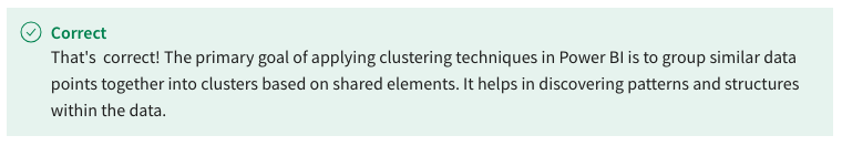
- To group similar data points together.
- To filter out noisy data points.
- To identify outliers in the dataset.
- Histogram bar charts display data distribution within bins, while standard bar charts show individual categories.

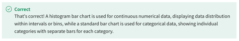
- Histogram bar chart represents continuous numerical data, while a standard bar chart represents categorical data.
- Histogram bar chart has separate bars for each category, while a standard bar chart has equal-width bins.
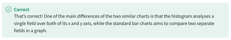
- Standard bar charts contain separate fields in their x and y axis, while histograms contain the same field for both axes.
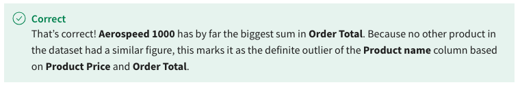
- Aerospeed 1000
- E-TrailBlazer 1000
- E-TrailBlazer 2000
- FreestyleMaster 1000
- 162.50% increase
- 42.59% increase
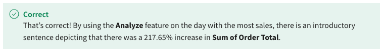
- 217.65% increase
- 460.00% increase
- Neither Credit card nor PayPal payments
- PayPal payments
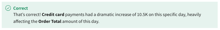
- Credit card payments
- Both Credit card and PayPal payments
- Bar chart
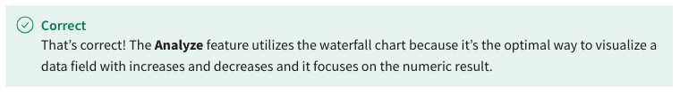
- Waterfall chart
- Pie chart
- Scatter plot
- It generates advanced visualizations with insights.
- It generates charts with insights and patterns from your data

- It generates visualizations and adds them to the report.
- It generates DAX measures.
- To add time zone information on time-based data
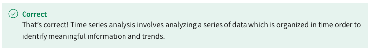
- To explore patterns and trends within time-based data
- To perform real-time data synchronization across sources
- To create interactive and dynamic dashboards
- To replace the axes labels in a chart or graph with custom lines
- To indicate potential outliers in the dataset
- To create subtotals and aggregate values in tables
- To highlight specific data points or values
- By generating predictive models based on historical data
- By automatically resizing visualizations for different devices
- By changing the color scheme of the visualization
- By providing additional insights into the underlying data
- They indicate the range of potential data variability.
- They link related data points together.
- They provide a Bar chart with errors in the dataset’s source.
- They replace the need for error data labels in charts.
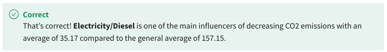
- 157.15
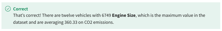
- 360.33
- 28/46
- 367.75
- Petrol
- Electricity/Diesel
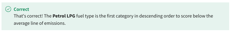
- Petrol LPG Petrol
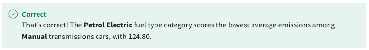
- Electric
- Top segments
- Quick Insights
- Low value

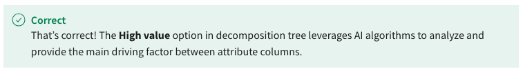
- High value
- Transmission
- Engine Size (cm3)
- Powertrain
- Car_id

- Key influencers

- Q&A

- Line charts
- Decomposition tree
- It identifies subsets of data that have a negligible impact on the measure.
- It ranks segments based on the combined influence of multiple factors.
- It highlights the least common categories within the dataset.
- It displays segments of data sorted by the least influential factors.
- Ad-hoc exploration of data patterns
- Highlighting outlier data points
- Identifying root causes of fluctuations

- Predicting future data trends
- Provides stakeholders with a channel to ask the Power BI developers technical questions
- Enables communication between report users through questions and answers
- Allows users to ask questions in natural language and generate relevant visualizations
- Automate complex data transformations
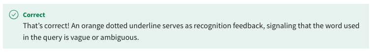
- Orange dotted underline
- Solid green underline

- Double red underline
- Dashed pink underline
- A scatter plot histogram and a card visual top 5 analysis.
- A scatter plot histogram and a funnel chart top 5 analysis.
- A bar chart histogram and a bar chart top 5 analysis.
- A bar chart histogram and a card visual top 5 analysis.
- Mean
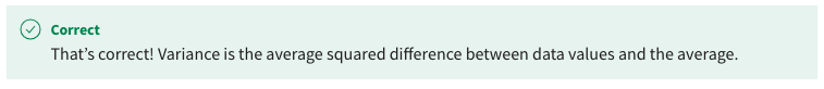
- Variance
- Average
- Median
- Binning data with Number of bins type
- Grouping data with column groups
- Clustering data with clustering technique
- Binning data with Size of bin type
- Altering between the axis types does not induce any numerical differences or adjustments on data points.
- Both axes’ data points can be sorted through the visualization settings.
- The option between continuous and categorical axes is only enabled in bar charts.
- Continuous axis is only available for columns with an inherent numerical order.
- Bar chart
- Waterfall chart
- Pie chart
- Line chart
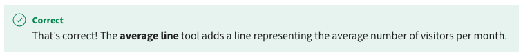
- Average line
- Min line
- Trend line
- Constant line

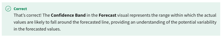
- It visualizes the range within which the actual values are likely to fall around the forecasted line.
- It represents the upper and lower bounds of the data used for forecasting.
- It provides a visual representation of the variability in the historical data.
- It indicates the margin of error in the forecasted values.
- The Q&A visual is specialized in creating intricate custom visualizations using code-based scripting.
- The Q&A visual is focused on generating advanced DAX calculations for complex datasets.
- The Q&A visual is limited to providing static textual summaries of the data in a report.
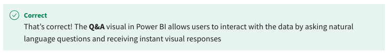
- The Q&A visual enables users to ask questions in natural language and receive visual responses from the data.
- Constant line
- Median line
- Average line
- Trend line
- Comparing regional sales performance across different product categories.
- Displaying the proportion of male and female customers in a retail dataset.
- Identifying the most common products purchased by different customer segments.
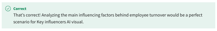
- Analyzing the factors contributing to employee turnover within the organization.
- Ambiguity in the word used, suggesting that it may correspond to multiple dataset fields.
- An indication that the word is irrelevant and should be excluded from the query..
- A successfully recognized field, measure, or entity from the dataset.
- An error in the syntax that requires correction before proceeding.
- By selecting Top N option in the visualization’s options
- By utilizing TOPN function in DAX

- By applying a Top N filter type in the Filter pane

- By typing Top N in a Q&A visualization query
- Median
- Variance
- Mean
- Average
- Error bars
- Reference lines
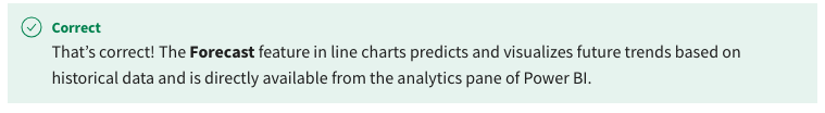
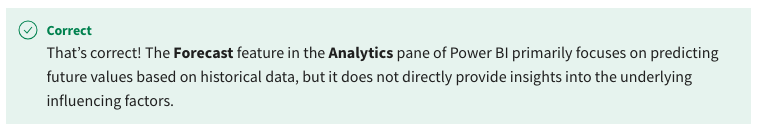
- Forecast
- Anomaly detection
- False
- True
- Normal distribution
- Variance
- Mode
- Standard deviation
- Bar chart
- Scatter chart
- Table visualization
- Line chart
- Increase root causes
- Spike analyze feature
- Predict future trends
- Explain the increase

- Analysing historical sales data to identify the most frequently purchased products.
- Displaying the geographical distribution of customer segments across different regions.
- Suggest a location with high sales potential for future franchise expansion.
- Predicting future revenue trends based on past performance.

- Use relative date filtering
- Return only the Top N.
- Include a tooltip attribute.
- Add a specific color to a visualization.