creative designing in power bi coursera week 2 answers

Self-Review: Optimizing a report for mobile

1. How many visual elements exist in the report design before the mobile layout?

  • 4
  • 3
  • 5

2. In the bubble chart of the report, what does the size of the bubble represent?

  • Total Sales

  • District size
  • Total Sales variance %

3. True or False: After you select a mobile layout for a report, you can change the title properties of any visual element. This setting does not affect the desktop layout.

  • False
  • True

4. What is the percentage difference of the Goal value to the Sales values in the KPI visual of the report?

  • +91.44%

  • -91.44%
  • 6.67%

5. What is the correct path to format the title of the chart?

  • Visualization > General > Properties
  • Visualizations > Visual > Title
  • Visualizations > General> Title

Knowledge Check: Laying out a report

6. Which Power BI visual is used for visualizing the density and distribution of data across geographical regions or grids?

  • 3D maps
  • Heat Maps

  • Treemaps

7. In the Power BI mobile layout which pane lists all the visuals that are included on the original report page?

  • Page Visuals pane

  • Selection pane
  • Visuals pane

8. True or False: Changing settings in the mobile layout does not affect the desktop layout.

  • True
  • False

9. Which chart type is used for exploring relationships between two numerical variables?

  • Scatter plots

  • Line Charts
  • Pie charts

10. Which chart type displays a single metric and its performance against a target or baseline?

  • Pie Chart
  • Bubble Chart
  • KPI Chart

Self-Review: Visualizing data by geographical location

In the exercise Visualizing data by geographical location, you put into practice your understanding of how to use map visualizations in a report in Power BI.

Your objective for this exercise was to complete the following tasks:

Review the data categories and types in the columns in the dataset.

Add a Shape map visual to display specific regional data.

Format and configure the Shape map visual.

Your final report should look like this:

Now you can use the following questions to make sure that you understood and executed the tasks correctly.

Don’t forget that you can revisit the previous learning items to recap the process steps.

11. How many state records exist in the data set?

  • 51
  • 50

  • 52

12. What is the total sales value for the state of California in the Shapemap?

  • $147,000.00
  • $210,000.00

  • $250,000.00

13. What was the data category of the State field before you applied any transformation?

  • Address
  • Country
  • Uncategorized

Knowledge Check: Map Visuals

14. What visuals are a geographic representation of areas, such as countries, states, or regions, that are shaded or patterned to illustrate quantitative data values?

  • Treemaps
  • Choropleth Maps

  • Shape maps

15. Which of the following projection methods is used to display three-dimensional earth as a two-dimensional cylindrical projection that converts the globe into a grid, with each rectangular cell having the same size, shape, and area?

  • Mercator
  • Orthographic
  • Equirectangular

16. True or False: Shape maps are most effective when visualized data has clear geographic boundaries.

  • True
  • False

17. What is the format of the vector files generally used in Shape Maps?

  • TopoJSON

  • Shapefiles
  • SVG

18. What visual connects to a cloud service hosted to retrieve location data, such as map images and coordinates used to create the map visualization?

  • Choropleth Maps
  • Shape maps
  • Azure Maps

Knowledge Check: Custom Visualizations

19. What is the potential security risk of using external Python libraries in Microsoft Power BI?

  • Exposure to security vulnerabilities in third-party libraries.

  • Limited performance and data processing capabilities.
  • Reduced/LimitedCompromised data visualization options.

20. How can you use Python in Microsoft Power BI? Select all that apply.

  • To create a custom visualization

  • For data modeling
  • For report optimization
  • To retrieve data from the data sources.

21. True or False: Custom visuals can be created in the Microsoft Power BI desktop and can then be published and shared through the Power BI service.

  • True

  • False

22. You are working with a multiple-table data model. If you enable Python scripting in Power BI and import the visualization library, what is the most important thing to do before creating Python visuals?

  • Ensure the fields used to create the visual do not contain duplicate values.
  • Ensure the data tables are related in the data model.

  • Ensure the data is clean.

23. What is a potential limitation of a Python visualization in Power BI?

  • You cannot cross-filter Microsoft Power BI core visuals by selecting a data point from the Python visuals.

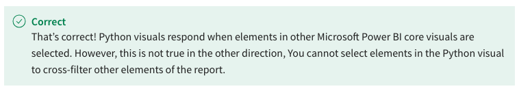
  • You cannot cross-filter a Python visual by making a selection in another core Microsoft Power BI visual.
  • You cannot share a Python visual with other team members.

Module Quiz: Designing Powerful Report Pages

24. What are the prerequisites for using Python-based visualizations in Microsoft Power BI? Select all that apply.

  • Import Python custom visuals from Microsoft AppSource.
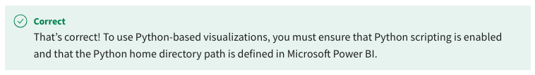
  • Ensure that Python scripting is configured in Microsoft Power Bl desktop.

  • Install Python on your local computer.

  • Import the Python visualization libraries.

25. What additional elements are often included in a KPI visual to provide context for the metric? Select all that apply.

  • Trend axis

  • Location information
  • Hierarchy
  • Target value

26. What advantages does a Dot plot give you over other visualizations for comparing data points? Select all that apply.

  • Its ability to use categorical information on the horizontal axis.

  • It allows for plotting multi-dimensional data.
  • Its ability to show hierarchical relationships.
  • Its simplicity and ease of interpretation

27. You are creating visualizations for a complex dataset in Microsoft Power BI to uncover correlations, patterns, and insights from the raw data. Upon careful review of the data, you realize the dataset contains multiple numerical fields. What is the primary challenge when plotting the current dataset?

  • Difficulty in finding a suitable chart type.
  • Handling a large volume of data without losing clarity.

  • Limited customization options.

28. True or False: You have created a combo chart in Microsoft Power BI with primary and secondary y-axes. Power BI allows you to visualize the chart data in a table form without creating a separate table visual.

  • True

  • False

29. What map visuals are available in Microsoft Power BI’s core visualizations pane? Select all that apply.

  • Filled maps

  • Shape maps

  • Heat maps
  • Azure maps

30. Adventure Works has multiple stores located in different regions and wants to analyze its sales values at various granular levels from countries to stores. As a principal data analyst, which visualization approach do you think is most suitable?

  • Create a Shape map visual with geo-hierarchy
  • Create a Filled map visual with geo-hierarchy

  • Create a Column chart with drill down functionality.

31. You are working as a Microsoft Power BI report designer in a multi-national retail organization. All the organization's data is hosted on Microsoft Cloud. The company wants to analyze the number of franchises in various regions and the sales amount associated with each franchise. Which map visual is the best choice for this?

  • Azure maps

  • 3D custom maps
  • Shape maps

32. True or False: You are working with an Adventure Works dataset with sales and categories. You have created a Bar chart using a Python visualization. You need to change the chart color and size. You can use the Format visual choice in Power BI to format Python-based visuals.

  • True
  • False

33. Adventure Works wants to analyze market share by its product categories and subcategories. Which type in Microsoft Power BI is the best option to display this data in a single visual?

  • Heat map
  • Treemap
  • Scatter chart

34. While working on a dataset and designing a report, you realize that you need to use a specialized chart type that is not available in the Microsoft Power BI Visualization pane. How do you solve this problem? Select all that apply.

  • Utilize Python-based visualization libraries.
  • Install a custom visual from Microsoft Power BI AppSource.
  • Use the Microsoft Power BI query editor and M language to generate a custom visual.
  • Create a custom visual using DAX.

35. In a Microsoft Power BI core KPI visual, which chart is automatically plotted when you add the main measure and trend axis to the visual fields.

  • Area chart
  • Stacked area chart
  • Scatter chart

36. How can you create a Bubble chart in Microsoft Power BI desktop? Select all that apply.

  • Importing a custom visual from Microsoft Power BI AppSource.
  • Selecting the Scatter chart in the Visualizations pane and then modifying it.
  • Selecting and modifying a Line chart from the Visualization pane.
  • Choosing it from the core Visualizations pane of Microsoft Power BI.

37. What Microsoft Power BI features is designed to help visually impaired users understand the content within a chart?

  • Turning the data labels toggle to the on position.
  • Adding a descriptive heading to the chart.
  • Adding Alt text to the chart.

38. True or False: In Microsoft Power BI, you cannot plot geographical information if the dataset does not have longitude and latitude columns.

  • True
  • False

39. You are building a Power BI report that needs to display up-to-date boundary information for different countries. What map type allows you to visualize this type of information?

  • Filled Map

  • 3D Map
  • Shape Map

40. True or False: The Microsoft Azure map visual provides better formatting and control options than other map visuals in Microsoft Power BI?

  • True
  • False

41. True or False: When using a Python visualization in Microsoft Power BI, the Python visual creates a dataframe. To create the dataframe, you need to bring all the required fields to the Values section of the visual.

  • True
  • False

42. You are a data analyst in an environmental agency. You are responsible for analyzing air quality, temperature variations, and pollution levels in various regions. A map visualization is an ideal approach to visualize such data. Which of the following visuals is most suited to representing this type of data?

  • Filled maps

  • Shape maps
  • 3D maps from AppSource

Leave a Reply