
data visualization with python coursera week 2 quiz answers
Basic Visualization Tools
1. Area plots are stacked by default.
- True
- False
2. The following code will create a histogram of a pandas series, series_data, and align the bin edges with the horizontal tick marks.
count, bin_edges = np.histogram(series_data)
series_data.plot(kind='hist', xticks = count, bin_edges)
- True.
- False.
3. The following code will create a horizontal bar chart of the data in a pandas dataframe, question. question.plot(type='bar', rot=90)
- True
- False
Specialized Visualization Tools

4. What do the letters in the box plot above represent?
- A = Mean, B = Third Quartile, C = First Quartile, D = Inter Quartile Range, E = Minimum, and F = Outliers
- A = Mean, B = Upper Mean Quartile, C = Lower Mean Quartile, D = Inter Quartile Range, E = Minimum, and F = Outliers
- A = Median, B = Third Quartile, C = Mean, D = Inter Quartile Range, E = Lower Quartile, and F = Outliers
- A = Mean, B = Third Quartile, C = First Quartile, D = Inter Quartile Range, E = Minimum, and F = Maximum
- A = Median, B = Third Quartile, C = First Quartile, D = Inter Quartile Range, E = Minimum, and F = Outliers
5. What is the correct combination of function and parameter to create a box plot in Matplotlib?
- Function = plot, and Parameter = type with value = “box”
- Function = boxplot, and Parameter = type with value = “plot”
- Function = plot, and Parameter = kind with value = “boxplot”
- Function = plot, and Parameter = kind with value = “box”
- Function = box, and Parameter = type with value = “plot”
6. Which of the lines of code below will create the following scatter plot, given the pandas dataframe, df_total?
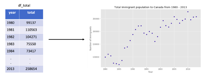
- import matplotlib.pyplot as pltdf_total.plot(kind=’scatter’, x=’year’, y=’total’)plt.title(‘Total Immigrant population to Canada from 1980 – 2013’)plt.xlabel (‘Year’)plt.ylabel(‘Number of Immigrants’)
- import matplotlib.scripting.pyplot as pltdf_total.plot(kind=’scatter’, x=’year’, y=’total’)plt.title(‘Total Immigrant population to Canada from 1980 – 2013’)plt.label(‘Year’)plt.label(‘Number of Immigrants’)
- import matplotlib.scripting.pyplot as pltdf_total.plot(type=’scatter’, y=’year’, x=’total’)plt.title(‘Total Immigrant population to Canada from 1980 – 2013’)plt.xlabel (‘Year’)plt.ylabel(‘Number of Immigrants’)
- import matplotlib.pyplot as pltdf_total.plot(type=’scatter’, x=’year’, y=’total’)plt.title(‘Total Immigrant population to Canada from 1980 – 2013’)plt.label (‘Year’)plt.label(‘Number of Immigrants’)
- import matplotlib.pyplot as pltplot(kind=’scatter’, x=’year’, y=’total’, data=df_total)plt.title(‘Total Immigrant population to Canada from 1980 – 2013’)plt.label (‘Year’)plt.label(‘Number of Immigrants’)