
- Making the report easily understandable to people who use assistive technologies for navigation.
- Helping people with cognitive disabilities understand the report easily.
- Making Power BI reports easily accessible from the
- Power BI Service. Ensuring visually impaired users can understand report visuals.
- High-contrast colors
- Focus mode
- Alt text
- Tab order

- Alt text
- High-contrast colors
- Tab order
- Focus mode

- Focus mode
- High-contrast colors

- Show Data Table
- Alt text
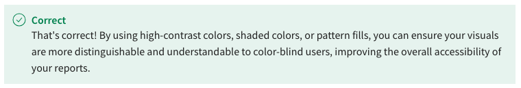
- Use high-contrast colors, shaded colors, or pattern fills
- Enable Focus mode
- Add more text descriptions to each report
- Increase the size of the visuals
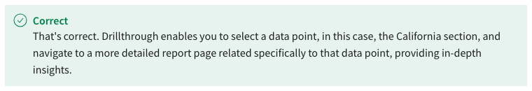
- Drillthrough
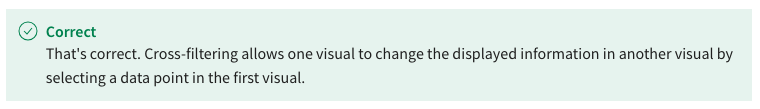
- Cross-filtering
- Drill-down
- Cross-highlighting
- Cross-highlighting

- Drillthrough
- Data visualization
- Cross-filtering
- Cross-highlighting
- Cross-filtering
- Drillthrough
- Drill-down
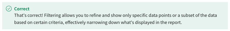
- Filtering
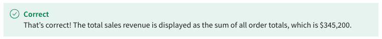
- Drillthrough
- Cross-highlighting
- Sorting
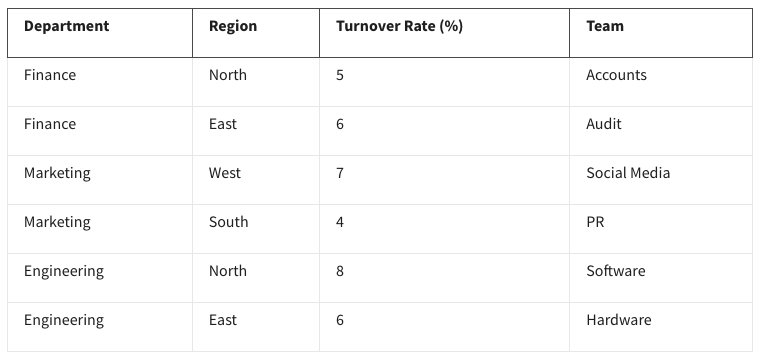
- Department, Region, Team, Turnover Rate
- Region, Department, Turnover Rate, Team
- Turnover Rate, Region, Department, Team
- Department, Team, Region, Turnover Rate
- $63,500
- $107,300
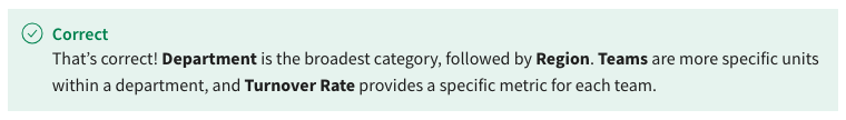
- $345,200
- $411,900
- True
- False
- $345,200
- $107,300
- $411,900
- $63,500

- Bookmark
- Slicer

- Button
- Drillthrough
- They improve the user experience
- They increase the interactivity of the report.

- They capture specific report states
- They limit filtering data in the report.
- A link to a URL on the World Wide Web.

- A link to a specific Power BI report page.
- A link to a specific Power BI report state.
- A link to a Power BI report.
- Visualization filter interaction configuration
- Current report page

- Slicers state

- Visualizations state

- True

- False
- True
- False
- By enabling the legend for the line chart

- By adding data labels to the line chart
- By using a pie chart instead of a line chart.
- By increasing the line chart’s opacity
- Legends
- Data labels
- Markers on line charts
- Focus mode
- False

- True
- Conditional formatting
- Themes
- Legends
- Drillthrough
- Cross-filtering

- Slicer filtering
- Cross-highlighting
- Drillthrough
- Creating a drill-down hierarchy in the data model
- Utilizing conditional formatting on the visuals
- Using slicers for each geographical level
- Adding tooltips with geographical details
- Add a button to clear all slicers

- Remove the slicers from the page
- Add a bookmark
- Disable the current page option for the bookmark

- Replace the bookmark with a slicer
- Replace the bookmark with a button
- Alt text complies with accessibility standards and regulations.
- Alt text helps users with visual impairments understand the content of visuals.

- Alt text improves the visual appeal of the report.
- Alt text is only required for visuals with complex designs.
- Data labels
- Legends

- Focus mode
- Markers on line charts
- True
- False
- Fonts and typography throughout the report
- Interaction behavior when clicking on visuals
- The data source and data transformations
- Colors used in visualizations

- Change the theme of the report to match the supply chain branding.
- Add conditional formatting to the product category field.
- Define drillthrough filters on the product category field.

- Create a drillthrough page with relevant visuals and filters.

- Sorting by column

- Data labels
- Themes
- Conditional formatting
- Improved interactivity

- Faster loading of visualizations
- Improved user experience

- A new bookmark must be created to account for the new visualization.
- New visualizations added after the creation of the bookmark will appear in a default state.
- New visualizations added after the creation of the bookmark will appear in a filtered state.
- True
- False
- Filters on this table
- Filters on this visual
- Filters on all pages

- Filters on this page

- Font color

- Underline text
- Bold text
- Data bars

- An address to a resource on the World Wide Web.

- An address to a web page on the World Wide Web.
- An address to a Power BI report page.