

- Slices
- Details labels
- Properties
- True

- False
- True

- False
- 37.74%
- 47.17%

- 70.09%
- Fonts

- Grids
- Colors
- Negative space

- Format Visual
- Build
- Visual Analytics
- Clear visual hierarchy
- Strategic positioning
- Consistent color scheme
- True
- False

- Leave an empty space between the vertical and horizontal visuals to make the elements more readable.
- Align visual elements vertically and horizontally.
- Set the title text of tables and charts as Marketing Budget Detail and Marketing Budget Chart.
- Chaotic pages have a cluttered layout with inconsistent use of colors and fonts, while cohesive pages have a clean and organized layout with consistent design elements.
- Chaotic pages have a symmetrical layout with a balanced use of colors and fonts, while cohesive pages have an asymmetrical layout with contrasting design elements.
- Chaotic pages have a minimalist design with limited use of colors and fonts, while cohesive pages have a vibrant and eclectic design with various design elements.
- Rules

- Individual colors
- Field value

- Gradient
- Visualizations > Format Visual >General >Properties
- Visualizations > Build Visual > Y-axis
- Visualizations > Format Visual > Visual > Columns

- True
- False
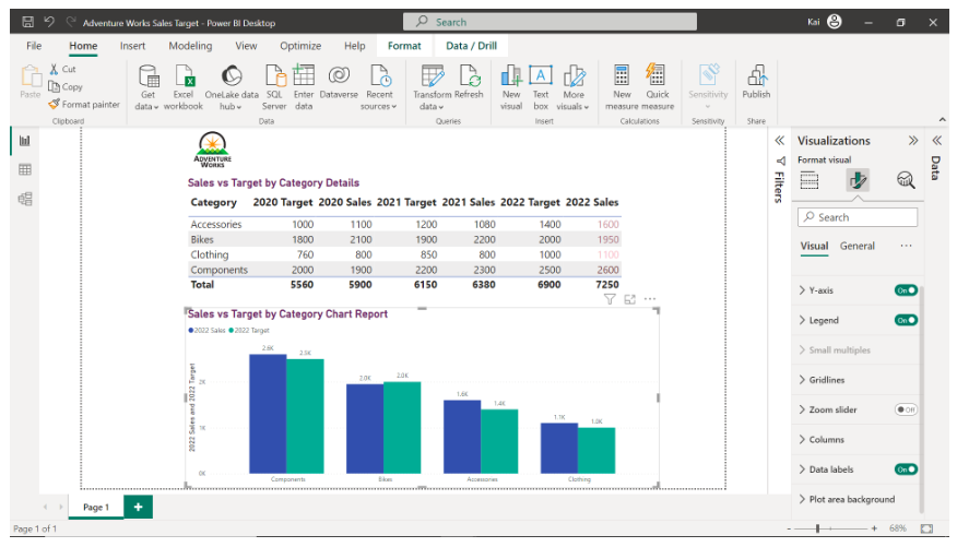
- 1100
- 1950
- 2600
- Role-based access control
- Access logs
- Secure data transmission
- Data integrity
- Access control
- Data anonymization

- True
- False
- Provide clear navigation.
- Implement interactive features and complex navigation.
- Incorporate vibrant colors and intricate visual elements.
- It enables the customization of reports to meet the audience’s specific needs and preferences.
- It helps increase the complexity of data visualization.
- It ensures that the data is only accessible by the data analysts.
- Color symbolism.
- Color harmony.
- The color wheel.
- True

- False
- Visualization
- Scale

- Positioning
- Cohesive
- Responsive
- Chaotic

- Cultural and demographic factors
- Time constraints
- Information needs
- colorful graphics
- animations
- interactive features
- True
- False
- Filter and slice
- Drill through

- Drill down
- Education data
- Passport number
- Favorite movie
- E-Mail address
- prohibited
- unauthenticated
- unauthorized
- Strategically using colors to communicate specific messages and elicit desired responses from your audience.
- Considering cultural context when selecting colors for global designs
- Pleasing arrangement of colors in a design.
- Yellow
- Blue

- Red
- True

- False
- outliers

- key information
- headlines
- True

- False
- Format data
- Data validation
- Consistency checks

- Filters
- Visualizations
- Conditional Formatting
- A consistent color scheme.
- A clear visual hierarchy

- A consistent typography.
- True
- False
- Providing details for closer inspection.
- Highlighting outliers.
- Focusing on headlines.
