- February
- April
- January
- March

- Thursday

- Monday
- Tuesday
- Friday
- E-Bikes
- Hybrid Bikes
- BMX Bikes

- Touring Bikes
- Bar charts
- Pie charts
- Column chart
- Line charts

- Pie charts
- Line charts
- Bar charts
- Tables

- Financial reports

- Sales reports

- Marketing reports

- External vendor reports
- To analyze the data
- To create, modify, and manage visual elements

- To manage the data
- To convert the data into text-based reports
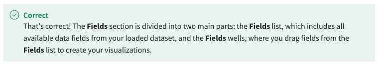
- Fields list and Fields wells
- Fields wells and Format wells
- Fields list and Format list
- Format list and Analyze tab
- Bar
- Area
- Line

- Pie
- Area
- Line
- Bar
- Pie

- Clustered bar
- Pie

- Treemap

- Donut

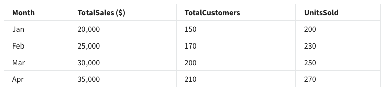
- TotalCustomers
- Month
- TotalSales

- UnitsSold
- Pie
- Donut
- Line

- Bar
- Bar chart
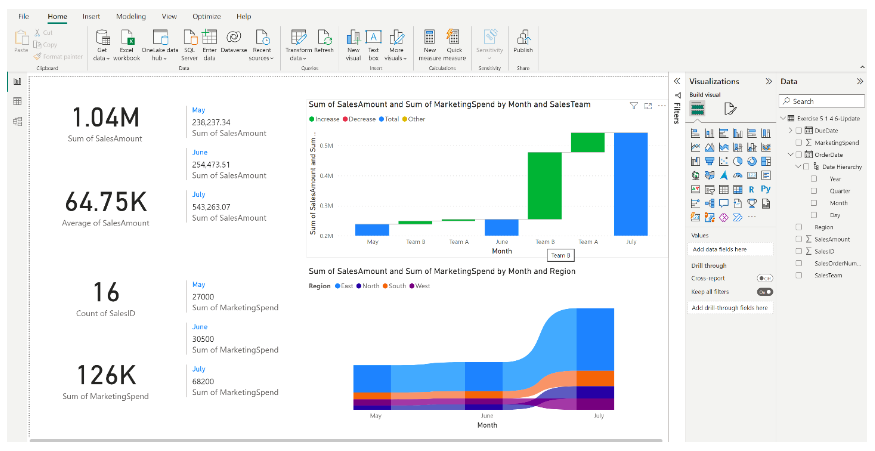
- Multi-row card

- Pie chart
- Card
- Waterfall Chart

- Line chart
- Ribbon chart
- Pie chart
- $126K

- $1.04M
- $64.75K
- 30.5K
- Scatter chart
- Waterfall chart
- Line chart
- Ribbon chart

- The North region
- The East region

- The West region
- The South region
- The colors indicate outliers.
- The colors represent different regions.

- The colors represent different annual sales.
- The colors are assigned randomly.
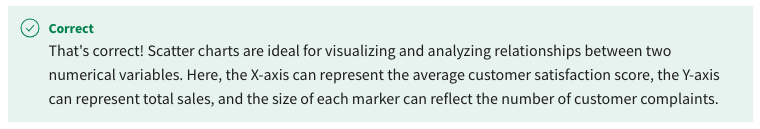
- Scatter plot
- Pie chart
- Funnel chart

- Bar chart
- Ribbon

- Funnel Chart
- Bar
- Line
- Customer retention rate
- Sales conversion rate

- Sales growth rate
- Customer acquisition cost
- Both ribbon and waterfall charts are used exclusively for financial data visualization.
- Ribbon charts are used to visualize the changes in ranking over time among various categories, while Waterfall charts are used to illustrate the cumulative impact of sequential positive or negative values.

- Ribbon charts are used to display the correlation between two variables, while waterfall charts are used to track a single metric over time.
- Ribbon charts are used to illustrate stages in a process, while waterfall charts represent the correlation between two variables.
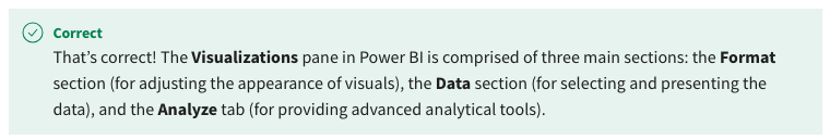
- The Format section, the Data section, and the Analyze tab
- The Design section, the Data section, and the Analyze tab
- The Import section, the Calculate section, and the Analyze tab
- The Format section, the Import section, and the Export section
- True
- False

- True

- False
- It allows the team to use make their reports more visually appealing.
- It transforms complex data into a more understandable, accessible, and usable format.

- It eliminates the need for data analysis.
- It increases the amount of data that can be collected.
- Treemap

- Pie
- Line
- Donut
- Donut chart
- Area chart
- Pie chart
- Line chart

- Line chart
- Waterfall chart
- Pie chart
- Funnel chart

- Scatter chart
- Bar chart
- Line chart
- Pie chart
- True
- False

- Export
- Data

- Import
- Format

- Table

- Bar chart

- Line chart
- Column chart
- To incorporate a high level of detail and complexity into your slides.
- To showcase the comprehensive datasets you have collected.
- To make your slides more visually appealing to the board members.
- To communicate the correct insights effectively.

- Data visualization can transform complex data into a more understandable, accessible, and usable format.

- Data visualization increases the amount of data that can be collected.
- Data visualization eliminates the need for data analysis.
- Data visualization aids in identifying patterns and trends in the data.

- Donut chart
- Pie chart
- Stacked area chart

- Line chart
- V6

- V10

- V5
- V7

- True
- False
- The space efficiency of a chart type does not impact the readability of the data.
- Both treemap and pie charts use the same amount of space to display the same data.
- Pie charts are more space-efficient than treemap charts.
- Treemap charts make more efficient use of space than pie charts.

- True
- False

- True
- False