
- Comparison charts
- Relationship charts
- Part to whole charts
- Correlation charts

- Line Plot
- Bar Charts
- Scatter plot
- Pie Chart

- Histogram
- Pie Chart
- Scatter Plot
- Line Plot

- qplot(), ggplot2()
- ggplot(), dplot()
- qplot(), dplot()
- qplot(), ggplot()

- It obscures the outliers in the data set.
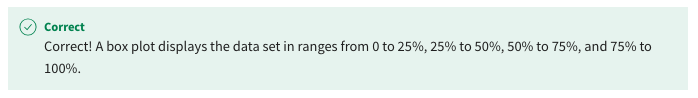
- It divides the data set into quartiles.
- It displays categorical data.
- It displays the mean of the data set.
- ggplot
- ggthemes
- tidymodels
- tidyverse

- addMarkers()
- addCircles()
- addProviderTiles()
- addTiles()

- fluidRow() creates a fluid page layout, which consists of rows that in turn include columns.
- The sidebartLayout() function scales components in real time to fill the entire browser width.
- splitLayout() function lays out elements vertically, dividing the available vertical space into equal parts.
- flowLayout() arranges elements in a layout with a side bar and main area.

- addTitle()
- titlePanel()
- tittleLayout()
- fluidTitle()
