data visualization with python coursera week 3 quiz answers
Advanced Visualization Tools
1. Seaborn is a Python visualization library that provides a high-level interface for visualizing geospatial data.
- True.
- False.
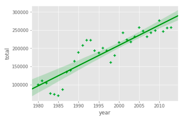
2. Which of the choices below will create the following regression line plot, given a pandas dataframe, data_df?

- import seaborn as snsax = sns.regplot(x=”year”, y=”total”, data=data_df, color=”green”, marker=”+”)
- import seaborn as snsax = sns.regplot(x=”total”, y=”year”, data=data_df, color=”green”)
- data_df.plot(kind=”regplot”, color=”green”, marker=”+”)
- import seaborn as snsax = sns.regplot(x=”year”, y=”total”, data=data_df, color=”green”)
- data_df.plot(kind=”regression”, color=”green”, marker=”+”)
3. The easiest way to create a waffle chart in Python is using the Python package, PyWaffle.
- True.
- False.
Visualizing Geospatial Data
4. You cluster markers, superimposed onto a map in Folium, using a feature group object.
- False.
- True.
5. The following code will generate a map of Spain, displaying its hill shading and natural vegetation.
folium.Map(location=[-40.4637, -3.7492], zoom_start=6, tiles='Stamen Toner')
- True.
- False.
6. A choropleth map is a thematic map in which areas are shaded or patterned in proportion to the measurement of the statistical variable being displayed on the map.
- True.
- False.
