
Week 1: Visualizing data
1. A data analyst wants to create a visualization that demonstrates how often data values fall into certain ranges. What type of data visualization should they use?
- Line graph
- Scatter plot
- Histogram
- Correlation chart
2. What do correlation charts reveal about the data they contain?
- Causation
- Relationships
- Changes
- Visualization
3. You are creating a presentation for stakeholders and are choosing whether to include static or dynamic visualizations. Describe the difference between static and dynamic visualizations.
- Static visualizations are interactive and can automatically change over time. Dynamic visualizations do not change over time unless they’re edited.
- Static visualizations do not change over time unless they’re edited. Dynamic visualizations are interactive and can automatically change over time.
- Static visualizations combine multiple visualizations into a whole. Dynamic visualizations separate out the individual elements of a single visualization.
- Static visualizations separate out the individual elements of a single visualization. Dynamic visualizations combine multiple visualizations into a whole.
4. Sophisticated use of contrast helps separate the most important data from the rest using the visual context that our brains naturally respond to.
- True
- False
5. Design thinking is a process used to solve complex problems in a visually appealing way.
- True
- False
6. Fill in the blank: During the _____ phase of the design process, you start to generate data visualization ideas.
- empathize
- ideate
- test
- define
7. A data analyst adds labels to their line graph to make it easier to read even though they already have a legend on their visualizations. How does labeling the data make it more accessible?
- Labeling doesn’t depend on interpreting colors
- Labelling adds contrast to a visualization
- Labeling creates more visual interest
- Labeling helps redirect focus from outliers
8. Fill in the blank: You should distinguish elements of your data visualization by _____ the foreground and background and using contrasting colors and shapes. This makes the content more accessible.
- highlighting
- separating
- overlapping
- aligning
9. A data analyst working for an e-commerce website creates the following data visualization to present the amount of time users spend on the site:
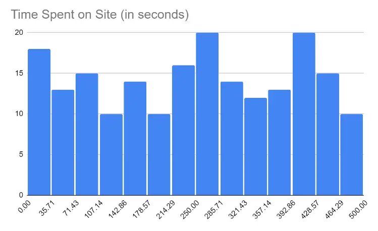
What type of visualization is this?
- Correlation chart
- Histogram
- Line graph
- Scatterplot
10. A data analyst is creating a chart for a presentation. The data they will display shows a correlation between variables. Why should they be careful when presenting their chart to an audience?
- Correlation can be misunderstood as causation.
- Correlation causes accessibility issues.
- Correlation should be avoided in charts.
- Correlation can only be represented in bar charts.
11. What type of data visualizations allow users to have some control over what they see?
- Aesthetic visualizations
- Dynamic visualizations
- Geometric visualizations
- Static visualizations
12. Design thinking is a process used to solve problems in a user-centric way.
- True
- False
13. During which phase of the design process do you try to understand the emotions and needs of your target audience?
- Prototype
- Ideate
- Test
- Empathize
14. A data analyst wants to make their visualizations more accessible by adding text explanations directly on the visualization. What is this called?
- Distinguishing
- Subtitling
- Labeling
- Simplifying
15. What should data analysts do to make presentations more accessible for people who are blind and people with low vision?
- Minimize contrast between colors
- Remove labels from data
- Provide text alternatives
- Avoid using shapes and patterns to differentiate data
16. You need to create a chart that displays the number of data records in each age group of a dataset. What type of chart would best represent this data?
- Histogram Chart
- Ranked Bar Chart
- Correlation Chart
- Time Series Chart
17. Which of the following is generally good practice when using bar charts?
- Display the bars in ranked order
- Make the gaps wider than the bars.
- Design bar charts with a single color.
- Avoid stacked bar charts.
18. What are the key elements of effective visualizations you should focus on when creating data visualizations? Select all that apply.
- Clear meaning
- Sophisticated use of contrast
- Visual form
- Refined execution
19. Fill in the blank: Design thinking is a process used to solve complex problems _____.
- as quickly as possible
- in a user-centric way
- using a set order of processes
- with minimal user input
20. Fill in the blank: A data analyst can make their visualizations more accessible by adding _____, which are text explanations placed directly on the visualizations.
- labels
- legends
- callouts
- subheadings
21. Distinguishing elements of your data visualizations makes the content easier to see. This can help make them more accessible for audience members with visual impairments. What are some methods data analysts use to distinguish elements?
- Ensure all elements are highlighted equally
- Separate the foreground and background
- Use similar colors and shapes
- Add a legend
22. You need to create a chart that explores how temperature changes throughout the year. What type of chart would best represent this data?
- Correlation Chart
- Time Series Chart
- Histogram
- Ranked Bar Chart
23. What type of visualizations give you the most control over the story you want to tell with your data?
- Static visualizations
- Dynamic visualizations
- Aesthetic visualizations
- Geometric visualizations
24. Fill in the blank: When choosing a chart you should choose the one that _____.
- makes use of the most modern visualization tool
- uses the least number of visual elements like size and shape
- uses as many visual elements like size and shape as possible
- makes it easiest to understand the point you are trying to make
25. A data analyst is designing a chart. They decide to use colors that make sense to their audience. What phase of creating data visualizations does this describe?
- Test Phase
- Ideate Phase
- Prototype Phase
- Empathize Phase
26. During which phase of the design process do you start to generate data visualization ideas?
- Ideate
- Test
- Empathize
- Define
27. What should you include in the headline of a data visualization?
- Abbreviations
- Clear language
- Acronyms
- Fancy typography
28. A data analyst is making their data visualization more accessible. They separate the background and the foreground of the visualization using bright, contrasting colors. What does this describe?
- Labelling
- Text alternatives
- Distinguishing
- Text-based format
29. Causation occurs when an action directly leads to an outcome.
- True
- False
30. What type of charts are effective for presenting the composition of data? Select all the apply.
- Pie chart
- Line chart
- Tree map
- Heat map
31. When using design thinking, what group of people should you think about the most?
- The general public
- Your team
- The shareholders
- Your users
32. You are in the ideate phase of the design process. What are you doing at this stage?
- Making changes to their data visualization
- Generating visualization ideas
- Creating data visualizations
- Sharing data visualizations with a test audience
33. Where is the best place to put labels that describe the meaning of individual data elements in a data visualization?
- Left of the chart area
- In the legend
- In the data
- Below the chart area
34. Fill in the blank: A data analyst creates a presentation for stakeholders. They include _____ visualizations because they don’t want the visualizations to change unless they choose to edit them.
- aesthetic
- dynamic
- static
- geometric
35. While creating a chart to share their findings, a data analyst uses the color red to make important data stand out and separate it from the rest of the visualization. Which element of effective visualization does this describe?
- Refined execution
- Clear meaning
- Sophisticated use of contrast
- Subtitles
36. You are in the process of creating data visualizations. You have considered the goal, the audience's needs, and come up with an idea. Next, you will share the visualization with peers. What phase of the design process will you be in?
- Ideate
- Define
- Test
- Empathize
37. What text element in a visualization should be placed above the chart and clearly state what data is being presented?
- Headline
- Label
- Annotation
- Subtitle
38. How much data should you represent when designing an effective data visualization?
- Include a subset of the data that your audience will like
- Only represent data that supports your initial hypothesis
- Include all of the data from your analysis to ensure that your data visualization is complete and accurate
- Only represent data the audience needs to understand your findings, unless it is misleading
39. A data analyst creates a histogram to share in a presentation. What are histograms used to demonstrate?
- How two or more values contrast and compare
- How much each part of something makes up the whole
- How data has changed over time
- How often data values fall into certain ranges
40. What can you do to simplify your visualizations to make them accessible to a broad audience?
- Use more text than visuals
- Remove data labels
- Reduce the amount of information
- Use abbreviations in headlines
41. Fill in the blank: A data analyst creates a presentation for stakeholders. They include _____ visualizations because the analyst wants the presentations to be interactive and automatically change over time.
- dynamic
- aesthetic
- geometric
- static