data analysis and visualization with power bi coursera week 1 answers
Self-review: Create a sales report
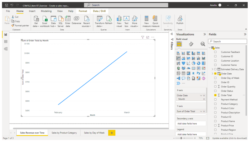
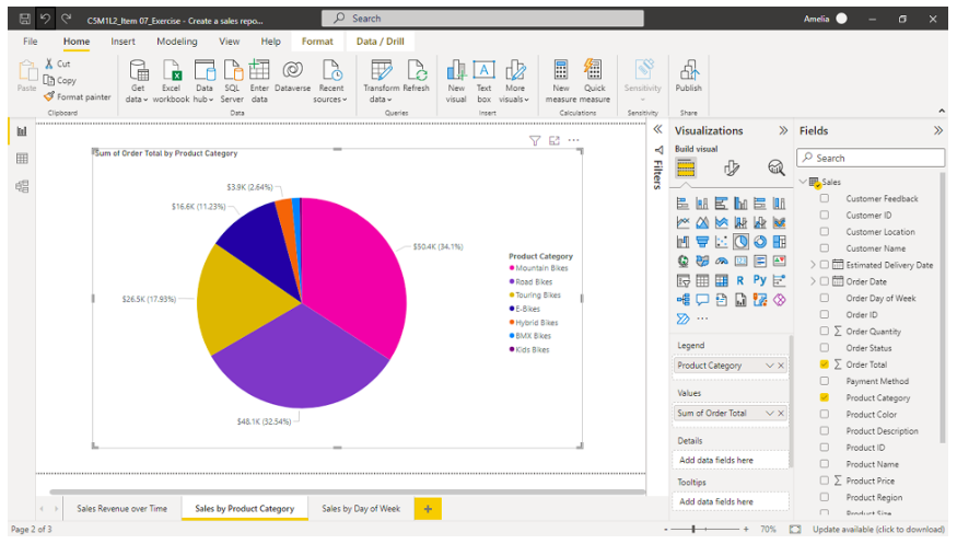
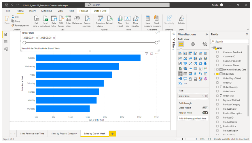
You created a basic sales report in Microsoft Power BI in the Create a sales report exercise. You represented Adventure Works' sales revenue over time using a line chart. To give the company more granular insight into this sales performance over time, you also created a pie chart representing sales by product category and a stacked bar chart illustrating sales by day of the week. Screenshots of the visualizations are included for you to refer to.


In this self-review, you will evaluate your learning by answering questions related to critical elements of the exercise.
1. Based on the line chart representing Adventure Works' sales revenue over time, which month recorded the highest sales revenue?
- February
- April
- January
- March

2. According to the stacked bar chart representing Adventure Works' sales by day of the week, which day recorded the lowest total sales?
- Thursday

- Monday
- Tuesday
- Friday
3. Based on the pie chart representing sales by product category, which bike type accounted for the second lowest amount of sales?
- E-Bikes
- Hybrid Bikes
- BMX Bikes

- Touring Bikes
Knowledge check: Introducing Visualizations
4. You are creating a data analysis report for the sales department at Adventure Works exploring sales of different bicycle models over the past five years. What type of visualization is appropriate to clearly and effectively demonstrate trends in bicycle sales over time for stakeholders?
- Bar charts
- Pie charts
- Column chart
- Line charts

5. At Adventure Works, the financial department requires raw, detailed data and exact numbers of bicycle production quantities as part of its cost analysis and financial reporting and planning. Which visualization is best suited to presenting the production quantities in this scenario?
- Pie charts
- Line charts
- Bar charts
- Tables

6. As the data analyst at Adventure Works, you are responsible for creating reports to inform and improve the organization's primary business operations. Which of the following report types are suited to this purpose? Select all that apply.
- Financial reports

- Sales reports

- Marketing reports

- External vendor reports
7. As a Power BI data analyst, you need to create data analytics reports, including sales reports for businesses like Adventure Works. What purpose does the Visualizations pane serve in the analysis process?
- To analyze the data
- To create, modify, and manage visual elements

- To manage the data
- To convert the data into text-based reports
8. You are creating a sales report using Power BI and need to manage and manipulate the data fields in your visualizations. When navigating through the Visualizations pane, what two main parts are available within the Fields section to accomplish this?
- Fields list and Fields wells

- Fields wells and Format wells
- Fields list and Format list
- Format list and Analyze tab
Knowledge check: Basic Visualizations
9. The sales manager at Adventure Works collected monthly sales data over the last two years. The data includes information about the sales volume for different products across different regions. You want to illustrate trends over time and compare the sales. What chart type is most suitable for this purpose?
- Bar
- Area
- Line

- Pie
10. The project manager at Adventure Works has been allocated a fixed budget for a new project. The funding is distributed across several categories: salaries, equipment, software, training, and miscellaneous expenses. You want to create a visual representation for the project manager that displays the proportion of the total budget that each category represents. What chart type is most suitable for this purpose?
- Area
- Line
- Bar
- Pie

11. The analytics manager at Adventure Works asks you to create a visualization that illustrates the distribution of website traffic sources, such as search engines, direct traffic, referral, and social media, as a proportion of total traffic. Which chart types are suitable for this purpose? Select all that apply.
- Clustered bar
- Pie

- Treemap

- Donut

12. Consider the following dataset for Adventure Works:

A store manager at Adventure Works wants to boost store revenue. What is the best key performance indicator (KPI) to represent in a targeted chart that will support the manager in making decisions related to this objective?
- TotalCustomers
- Month
- TotalSales

- UnitsSold
13. Adventure Works ran an online ad campaign for a new product over the past month. Each week, the marketing team counted how many people viewed the ad (impressions), how many people clicked on the ad (clicks), and how many people bought the product after clicking on the ad (conversions). You want to create a report that displays how these numbers changed weekly. What chart type is the best choice for this?
- Pie
- Donut
- Line

- Bar
Self-review: Indicating business performance
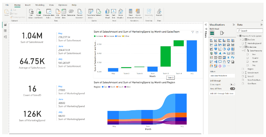
In the exercise Indicating business performance, you created a report complete with key performance indicators (KPI) visualizations for the sales team at Adventure Works using Microsoft Power BI. Your final report should resemble the following screenshot:

Answer the questions that follow to test your understanding of the process. Remember that you can refer to the previous lesson items if required.
14. What type of visualization was used to display the total monthly marketing spend?
- Bar chart
- Multi-row card

- Pie chart
- Card
15. What type of visualization did you use to analyze the change in sales over time and its correlation with marketing spending?
- Waterfall Chart

- Line chart
- Ribbon chart
- Pie chart
16. What was the total marketing spend in three months?
- $126K

- $1.04M
- $64.75K
- 30.5K
17. Which chart did you use to analyze the change in sales performance of different regions and changes in their rankings over time?
- Scatter chart
- Waterfall chart
- Line chart
- Ribbon chart

18. Based on your analysis, which region performed the best in sales compared to their advertising expenditure?
- The North region
- The East region

- The West region
- The South region
Knowledge check: Specialist Visualizations
19. As a data analyst for a large retail chain, you have created a scatter chart in Microsoft Power BI to compare store size (X-axis) against annual sales (Y-axis) for various stores. You have also used a categorical variable Region for the color legend. While presenting the chart in a meeting, your manager asks you why some stores of the same size have different colors. How would you respond?
- The colors indicate outliers.
- The colors represent different regions.

- The colors represent different annual sales.
- The colors are assigned randomly.
20. Imagine you're working on a sales report using Microsoft Power BI. You want to visualize the flow of leads through different stages of your sales pipeline. You start with the initial number of leads, followed by the number who were contacted, those who were qualified, the number of proposals sent, and finally, the successful sales made. Which visualization tool in Power BI would be most appropriate for this scenario?
- Scatter plot
- Pie chart
- Funnel chart

- Bar chart
21. You are a data analyst at Adventure Works. Your task is to provide a visualization that allows the management to understand the ranking shift in bicycle sales over different quarters of a fiscal year across various models. Which of the following charts in Microsoft Power BI would you choose?
- Ribbon

- Funnel Chart
- Bar
- Line
22. You are a sales manager at a growing tech company. You have been asked to track a new KPI that shows how effective the sales team is at converting leads into customers. You have calculated the percentage of potential customers who have made a purchase. Which KPI are you tracking?
- Customer retention rate
- Sales conversion rate

- Sales growth rate
- Customer acquisition cost
23. Which of the following statements is true about ribbon and waterfall charts in Microsoft Power BI?
- Both ribbon and waterfall charts are used exclusively for financial data visualization.
- Ribbon charts are used to visualize the changes in ranking over time among various categories, while Waterfall charts are used to illustrate the cumulative impact of sequential positive or negative values.

- Ribbon charts are used to display the correlation between two variables, while waterfall charts are used to track a single metric over time.
- Ribbon charts are used to illustrate stages in a process, while waterfall charts represent the correlation between two variables.
Module quiz: Creating Reports
24. As a data analyst at Adventure Works, you're handling a project that involves evaluating the company's marketing campaign performance. You've decided to use Microsoft Power BI to create a visually appealing report that clearly communicates the campaign outcomes. In the process of building your report, which of the following combinations accurately represents the sections of the Visualizations pane you will primarily be using?
- The Format section, the Data section, and the Analyze tab

- The Design section, the Data section, and the Analyze tab
- The Import section, the Calculate section, and the Analyze tab
- The Format section, the Import section, and the Export section
25. True or False: You’re currently working on a large-scale project analyzing customer purchase patterns across Adventure Works’ product categories. The product categories each have detailed and lengthy labels. A line chart is a suitable visualization for comparing customer purchase patterns across a large number of product categories with detailed and lengthy labels.
- True
- False

26. True or False: You’re a data analyst at Adventure Works, tasked with introducing Microsoft Power BI to the supply chain team, who are unfamiliar with this tool. You inform them that carefully selecting the correct type of visualization for the data is critical to ensure the right insights are communicated effectively. Is this statement true or false?
- True

- False
27. As a data analyst at Adventure Works, you've been asked to help a team understand the value of data visualization in their business intelligence process. Which statement best describes the primary function of data visualization?
- It allows the team to use make their reports more visually appealing.
- It transforms complex data into a more understandable, accessible, and usable format.

- It eliminates the need for data analysis.
- It increases the amount of data that can be collected.
28. You are a data analyst and you want to visualize sales data for different product categories and sub-categories in a single view. Which type of chart would be best suited for this scenario in Microsoft Power BI?
- Treemap

- Pie
- Line
- Donut
29. As a data analyst for a stock trading firm, you are tasked with creating a visual representation of the daily closing prices of a particular stock over the last year. Which chart type would be the most suitable choice in this scenario?
- Donut chart
- Area chart
- Pie chart
- Line chart

30. You've been tracking the monthly sales and advertising spending of a company's product line over the past two years. You want to show the correlation between advertising spending and sales and the trend of sales from different product categories. Which chart type would be the most suitable choice in this scenario?
- Area chart
- Line and stacked column chart
- Bar chart
- Line chart
31. What is an appropriate visualization to display sequential data in multiple stages?
- Line chart
- Waterfall chart
- Pie chart
- Funnel chart

32. The regional sales team of a large retail corporation wants to evaluate their performance over the last year. They've collected data including the average customer satisfaction score, total sales, and the number of customer complaints received per month for each store in the region. Which type of visualization would be most suitable for analyzing the relationship between average customer satisfaction score and total sales, while also considering the number of customer complaints per store?
- Scatter chart

- Bar chart
- Line chart
- Pie chart
33. True or False: Using KPI visuals in Microsoft Power BI is essential for every organization, regardless of its size or industry.
- True
- False

34. The sales department at Adventure Works wants to understand their quarterly performance. They need a comprehensive report that clearly depicts the various metrics involved. While adjusting your visuals to best illustrate the sales data, which sections of the Visualizations pane in Microsoft Power BI would you likely be interacting with? Select all that apply.
- Export
- Data

- Import
- Format

35. As a data analyst at Adventure Works, you are tasked with creating a Microsoft Power BI report for the marketing team. The report needs to compare data on the performance of a large number of product categories, each with detailed and lengthy labels. Which visualization types should you consider using? Select all that apply.
- Table

- Bar chart

- Line chart
- Column chart
36. Imagine you're a data analyst at Adventure Works. You are preparing a presentation for an upcoming board meeting. You have a variety of data points from different aspects of the business that you want to share. Which of the following should be your primary focus when deciding on visualization types for your presentation?
- To incorporate a high level of detail and complexity into your slides.
- To showcase the comprehensive datasets you have collected.
- To make your slides more visually appealing to the board members.
- To communicate the correct insights effectively.

37. As a data analyst at Adventure Works, you are assigned to create a presentation to convince management about the benefits of using data visualization in the company's business intelligence process. What points would you highlight in your presentation? Select all that apply.
- Data visualization can transform complex data into a more understandable, accessible, and usable format.

- Data visualization increases the amount of data that can be collected.
- Data visualization eliminates the need for data analysis.
- Data visualization aids in identifying patterns and trends in the data.

38. You are analyzing data for a multi-department company and want to show how each department's monthly expenses contribute to the total expenses over a year. Which chart type would be the most suitable choice in this scenario?
- Donut chart
- Pie chart
- Stacked area chart

- Line chart
39. Based on the vehicle performance dataset below, which vehicle(s) would you consider to be outliers? Select all that apply.
- V6

- V10

- V5
- V7

40. True or False: You're discussing data visualization strategies with your colleagues at Adventure Works. One of them states, "The main purpose of data visualization in business intelligence is to increase the amount of data that can be collected."
- True
- False

41. In Microsoft Power BI, which of the following statements is true about using the report area space more effectively?
- The space efficiency of a chart type does not impact the readability of the data.
- Both treemap and pie charts use the same amount of space to display the same data.
- Pie charts are more space-efficient than treemap charts.
- Treemap charts make more efficient use of space than pie charts.

42. True or False: A line and clustered column chart is most effective when used to display the composition of a total, with each segment of the column representing a part of the whole.
- True
- False

43. True or False: An outlier in a dataset is always indicative of a data entry error.
- True
- False

